
Responsive Brands
The impact on culture and communication with the advent of digital spaces is undeniable. Not only do we now consume material in multiple ways, we now have the autonomy to choose when and why.
With these choices comes the hard task of communicating brands in an effective way knowing that these options are growing every year. The logo restrictions of the past are being removed to make way for more adaption and more flexible execution in how these branded elements are used.
Screen widths and the many options a user now has in communicating with your brand are still expanding. With this expanding in options comes a need for your brand to think more cleverly with how it functions in these different spaces. As designers and brand strategists, it is our job to consider how to apply your logo, brand and branding on your website and apps.
Navigating a website provides many options for a brand to minimise brand elements that best fit in confined spaces. The use of colour, fonts and logo variations can help to reinforce brand identification without the use of all of the original brand elements. Don’t be afraid to let go of the word mark if the user is already using your app or navigating through scrolling pages. The logo can change to always be in plain sight. The more exposure to your brand, however small helps the user to always identify where they are at all times.
Below are a few examples of responsive branding being explored by designers around the world. These are just two of the many concepts we consider when applying brand and consumer strategies to different projects.
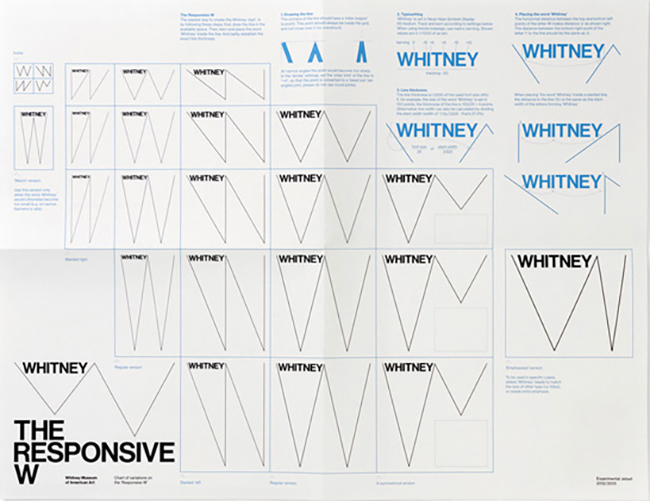
Whitney Museum of Modern Art
In this example the brand element ‘W’ variations are used to reflect a diversity in the way it is applied. Despite there not existing any fixed or original logo, the Whitney identity is easily identifiable despite the myriad of different ways it is applied to its brand strategy.
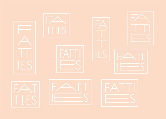
Fatties Brand Identity
In this example the typographical structure of the logo changes to adapt width and height variations. It becomes an interesting visual metaphor for the name itself. This allows the logo to be easily identifiable because the look and feel in consistent.
Source
Whitney Museum Identity
http://www.experimentaljetset.nl/archive/whitney-museum-identity
Image from Experiment Jetset
Designers – Experiment Jetset
Fatties Bakery Identity
http://identitydesigned.com/fatties-bakery/
Image from Identity Designed
Designers – Dot Dash
