Healthcare Marketing – Health Navigator
Let us share with you a project we ran in conjunction with a development team to market a Health Assessment Tool that is called Health Navigator. This blog post covers our thinking and planning insights that went into getting this project off the ground. Read the case study and see the final artwork here
Objectives
The Primary Objective of this campaign is to develop awareness and drive user engagement of a free, easily accessible and convenient online personal health assessment tool called Health Navigator. The Health Navigator tool will drill through a range of considered questions and statistics to provide a real and accurate self-assessment report with indicators for areas of immediate or long-term concern.
The Secondary Objective is to steer relevant Health Navigator users to ‘user profiled’ recommended GP services as well as a broad range of supported lifestyle programs.
Strategic Approach
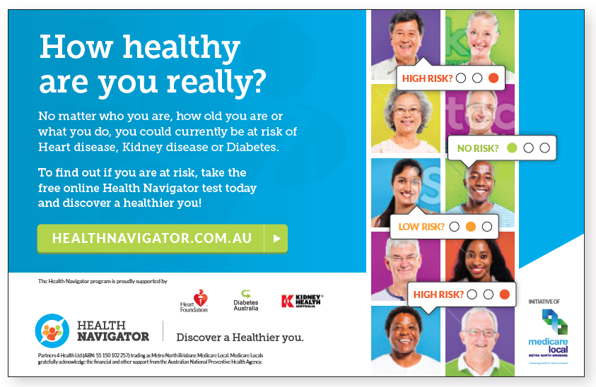
The proposition of ‘How healthy are you really?’ is relevant to all demographics regardless of ethnicity or social standing. It forces us to consider the ‘answer’ in our mind, based on our individual self-assumptions and ignorances about our own health, and then proposes that the ‘real truth’ can be easily discovered by using the Health Navigator tool. The choice to ‘discover a healthier you’ is a simple one, and with the right messages delivered with the right mix of media, so it will be so for the wider public and our specific target groups.
Photographic Approach
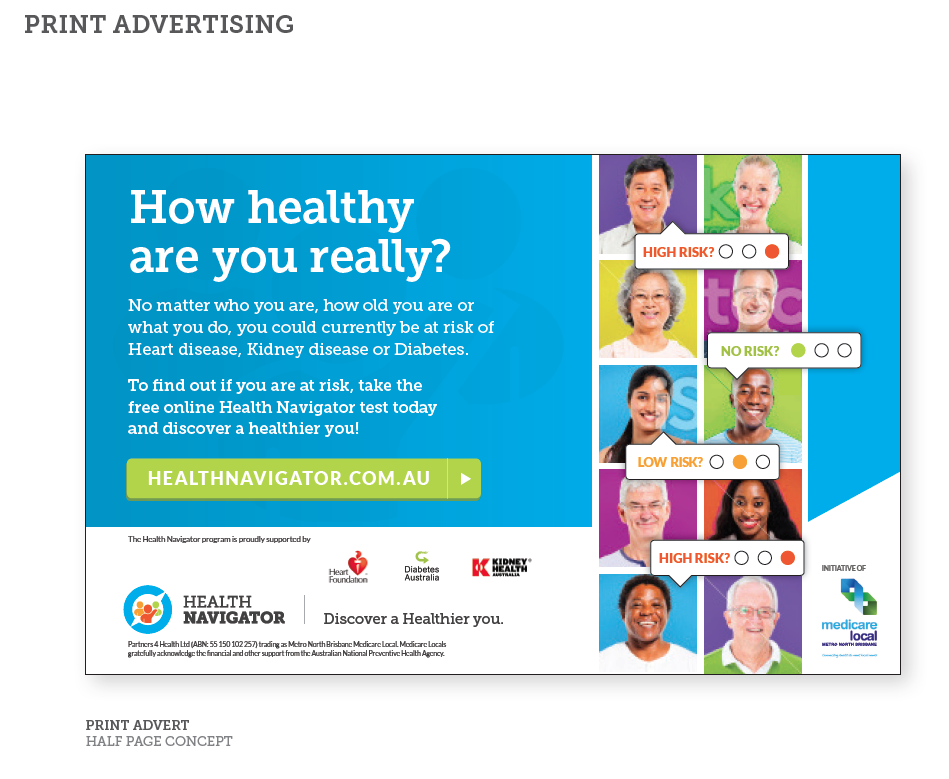
The photographic approach that we are suggesting is very people centric and highly visual promoting a diverse range of age groups and ethnicity to ensure that the market understands that Health Navigator is a tool for everyone.
Presenting the message
We have developed a corporate, yet inviting and approachable communications style which would roll across all advertising and communication tasks and touch points. Visually our aim is to instill a sense of trust and expectation for the tool.
The primary message is clearly presented as are the supportive benefits of finding out how at risk you really are. This Campaign style is flexible enough to hero the Health Navigator tool, while still allow the MNBML brand and partnerships to be included.
The colour palette is empathetic with MNBML and provides a highly visible campaign full of energy. The ‘Power of Paradox’ is used by presenting seemingly healthy and happy people with the integration of our ‘risk element’.
The visual proposes that just because you look or perceive yourself as healthy (or healthy enough) you may of course actually be at risk and Health Navigator can give clarity around that real or potential risk.
Banner Ads
Strategically sound and creatively resolved ideas should be both flexible enough and strong enough to work well in any media or channel delivery. It is said that the true test of a strong idea is to design a billboard, the same philosophy applies to Web Banners, both need to communicate a single-minded idea in a way that is visually anchored back to the rest of the campaign for greater cut-through and frequency of message.
Responsive Website
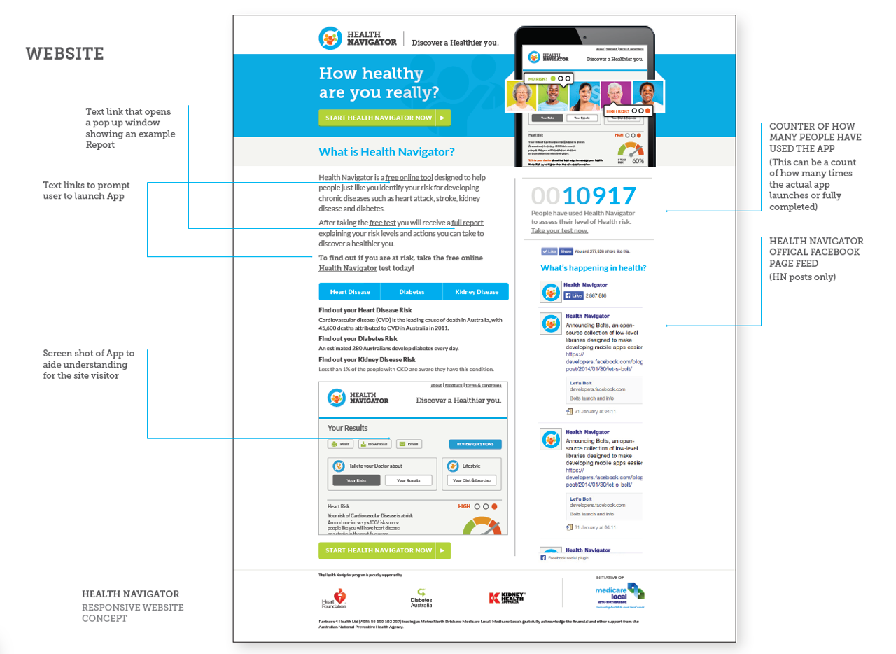
Our single page website for healthnavigator.com.au will give insight into what is Health Navigator and what it can do for you while driving the action of ‘starting’ an actual assessment.
Additional value to the page would be to pull in the official Health Navigator Facebook Posts (Not including friends of HN comments so we can control the displayed content) to help with SEO (keywords and content within the actual posts) as well as increase user engagement for the site visitors.
Another thought is to have a ‘ticker’ to display the number of HN Assessments launched (or completed).
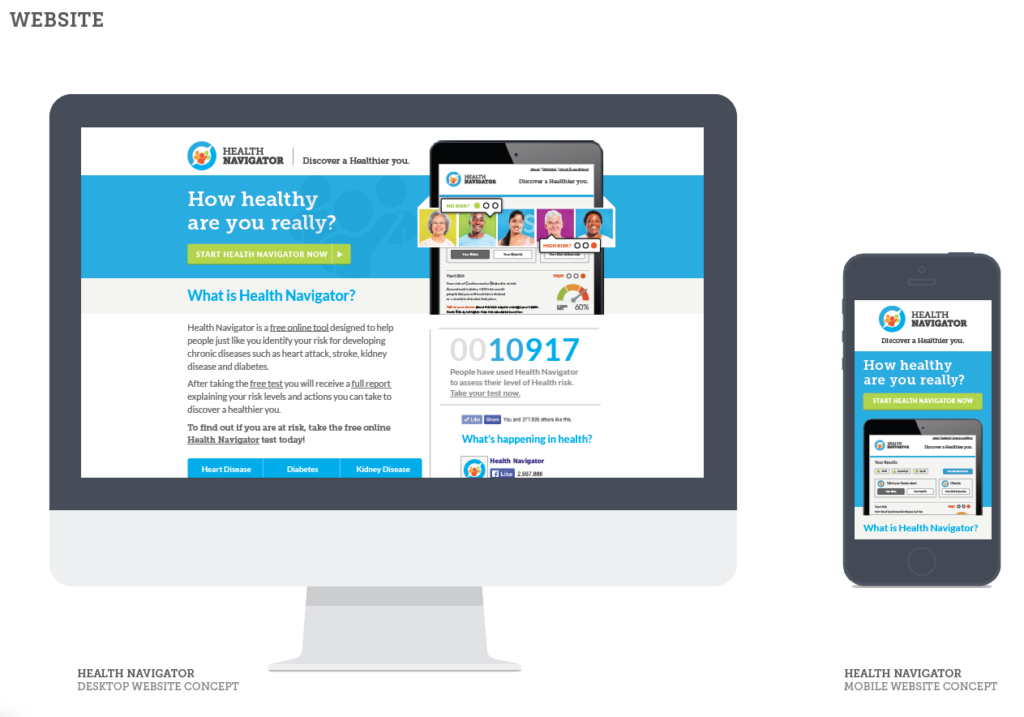
Responsive Design for Desktop, Tablet and Mobile
The main desktop version of the website will dynamically reconfigure to suit the browser size on Desktops, Tablets and Smart phones ensuring the tool is accessible and functional on any device.
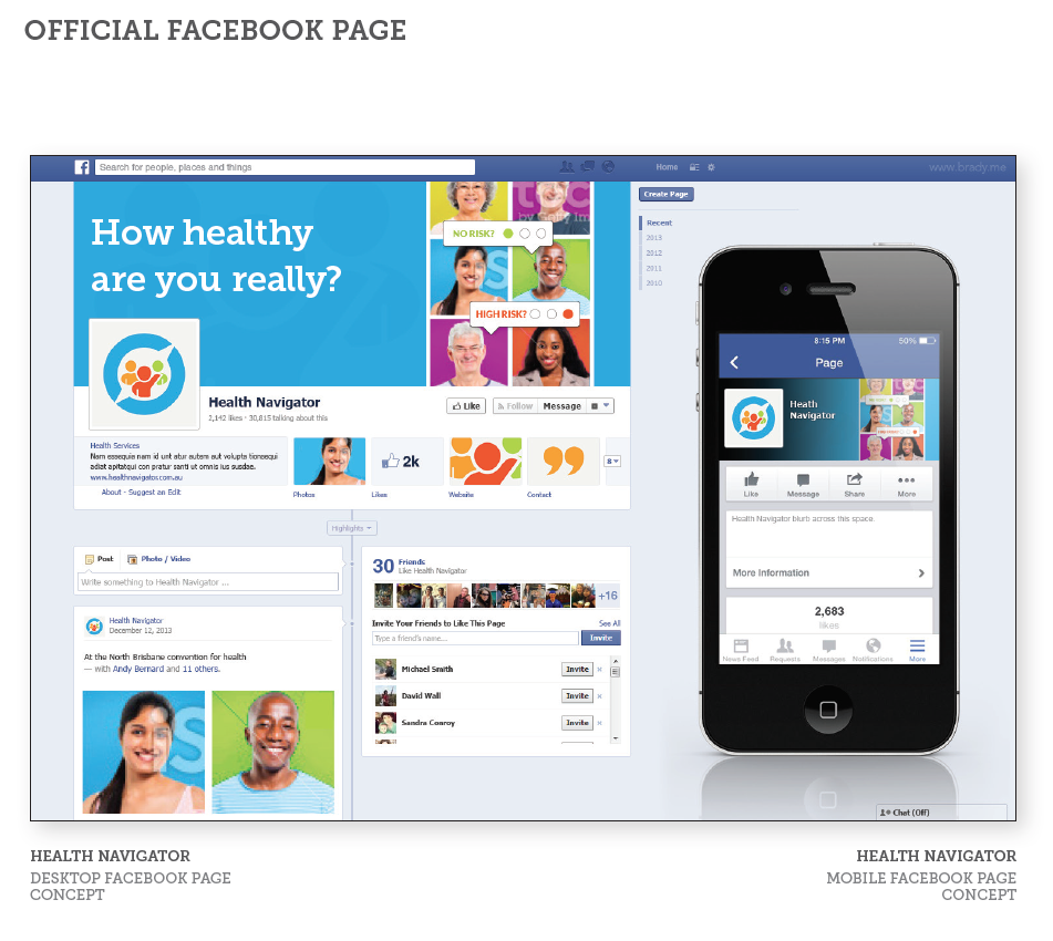
The creative can be easily applied to HN official Facebook page ensuring all touch points carry a consistent message and visual styling to keep the campaign equity intact. This consistency enhances the ‘snowball effect’ which is the desired goal for all advertising.
Assessment Units
Self (or Aided) Assessment units
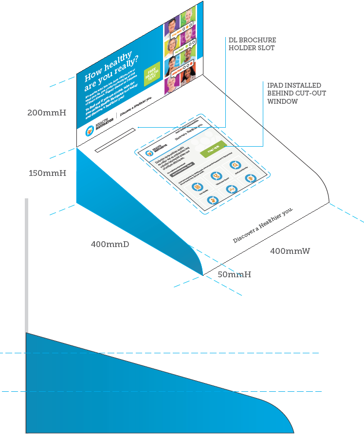
These desktop units have been designed for placement within secure aided assessment or self assessment environments such as Pharmacies and Community centers.
Each unit would contain a hidden iPad (using local Wifi or USB dongle access etc) with the screen accessible via a cut out window. These units ensure that the Health Navigator messaging and brand values remain intact while providing a highly visible, portable and functional touch point.
Find out your point of difference that will give you your marketing advantage.
We love working in the medical space as for us we have the chance to use our marketing skills to help those people and businesses that help many many people lead healthier and more fulfilled lives.
If you want to find out more about how we can help you define what you are really selling then get in touch. We work with people and businesses from all over the world and help them be seen and heard.
We look forward to hearing from you.
