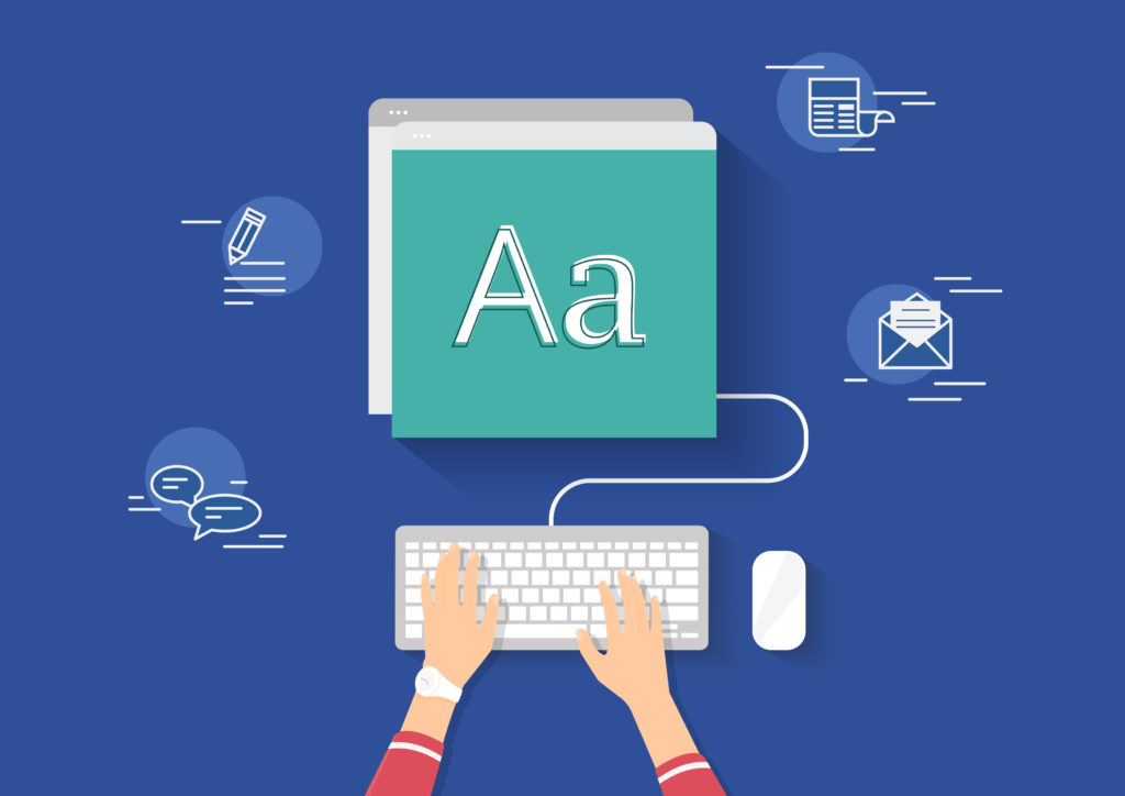
Brio’s Best Practices for Typography in Digital Design
 Typography plays a significant role in communication through websites or mobile apps to establish a clear connection with users. Good typography makes the act of reading easy, while poor typography turns users off.
With this in mind, we’ve come up with a simple list of commandments when designing for digital, to make your content as user-friendly as possible:
- Keep the variety of fonts to a minimum
Limit the number of typefaces used to avoid the website or app looking busy and unstructured. Two typefaces are plenty and one is adequate. Ideally, you’ll stick to the same ones through the entire website or app.
- Keep font size in mind
The size of the text has a huge impact on the experience of reading something on-screen. The general rule of thumb is:
- Desktops: 16 px font or higher for body text
- iOS devices: Text size that is at least 11 points (it is readable at a typical viewing distance without zooming).
- Android: Minimal readable font size is 12 sp, but it is highly recommended to use at least 14 sp for the main text.
- Choose fonts with distinct letters
We recommend using a sans serif typeface for website or apps, as it has clear spacing and easy to distinguish one letter from another.
- Consider a typeface that works well at various sizes
Users will access a website or an app from devices with different screen sizes and resolutions. It is important that the typeface works well in multiple sizes to maintain readability in every size.
- Satisfactory colour contrast
The use of colour and contrast in a website or an app is important to help users see and interpret the text. Contrast is particularly important when designing for mobile apps because of the potential for a distracting glare.
Keep these simple keys in mind when designing for digital, and your users will be happy little Vegemites. Simples!

